Office Jogger

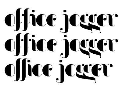
When working on this type design some of the glyphs bump up to each other. The solution was to provide contextual alternates. And ligatures. Either can be used. Any preferences?
When working on this type design some of the glyphs bump up to each other. The solution was to provide contextual alternates. And ligatures. Either can be used. Any preferences?