


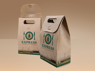
Craft food package for project restaurant "Express"

Restaurant - "EXPRESS"
obtained
The atmosphere of a train ride somewhere in Europe with a beautiful view and food from countries of the world
The difference in one restaurant.
Target Audience
The target audience is young and middle-aged people (aged 25-55) with an average income and above. These are couples in love and small groups of friends, tourists who came for a trip to Haifa (Israelis and tourists from other countries in the world) who came to the city from the port of Haifa. It is people who love hiking, new interesting places, food of different nations of the world and beaten quiet atmosphere. This is true for both men and women of equal proportions.
Logo
The purpose of the logo is to convey a sense of riding an old, beautiful and expensive train that looks like an "Oriental Express".
Colorful
The colors were also chosen to convey the atmosphere of the period. Turquoise color psychology symbolizes calmness, regularity, which was inherent in traveling by train. Golden color - symbolizes wealth, in this style the interior of the railway cabin was made.
Special elements
The bottom stripe of the turquoise color, which is found on all components of the corporate identity, symbolizes the part of the train card that the inspector used to rip, which means you have the right to ride the train and everything is fine.