Rebound Tinyletter

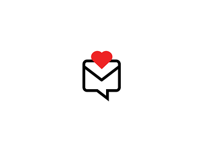
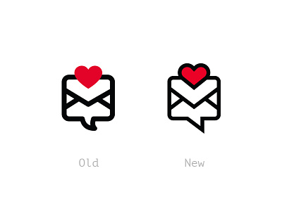
Wanted to give a try, and did this quick rebound of the new TinyLetter logo by @David Sizemore.
What I didn't like, in my humble opinion is the outline added to the heart, I really prefer it without, so I went and took it off. I also took off the two bottom line of the fold, I think the above "tongue" of the letter would make it clearly identifiable as a letter... And most of nowadays letters come with the fold on the sides.
Tell what you think guys? Do you see this as an improvement or did I screwed it and took off all personality from the visual?