C. Martin Logo Comp 2

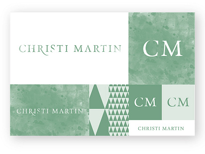
Another shot of a comp I've been working on for a photographer friend of mine. This was the selected comp for the final. The idea behind the typography was based around many of her shots where the light coming from behind distorted or subtracted from the silhouette in front. I tried to mimic this effect in the letterforms. I consider it a pretty decent execution.
