SaaS: Cloud Storage Dashboard

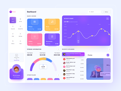
Hi! I saw that pretty UI and it was calling me to improve its UX and fix few small mistakes with icons such as boxing in box. Original was made by Murad.
Take a look at his work: https://dribbble.com/shots/15832433-SaaS-File-Management-Dashboard
You can take a look at the process and renders for colorblind simulation in my Figma File there: https://www.figma.com/file/c6gYPj5rxoSv8VKcYEhTKh/SaaS:-Cloud-Storage?node-id=0%3A1
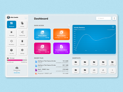
I have took Morad's work on my workbench and replaced few things I think are better for UX such as removing borders and boxing of icons and making them more visible for accessibility reason and clarity of the Interface.
I picked filled icons for the same purpose.
I moved "Storage use information" to a side panel and removed User profile card that was just saying role and name and had no obvious reason to exist.
I added more button to user header in side panel on the top.
More icon on the right of "☁ Storage" is meant to be used as "Upgrade your plan" or "Change Your Plan" I want apility to sell more of the service on the dashboard but not screaming at user "Your storage is almost full, upgrade your plan" That is a decision that user has to make. It also allows to hide "more services" in menu after clicking the button.
Instead of Preview squized with Recent Files History I moved recent files and added information like what device used it last for security, thinking that that would be used by family and someone is administrating it and wan't to know what device it was accessed by or user when shared. Clicking file name will bring a pop-up showing a preview.
Shortcuts are for personalizing the Dashboard. I don't want to tell the user what they should look at and say them that is the best you need. It's more of make your own quick access after what I think is valuable to see on the Dashboard that is meant to manage files and storage use.