


Almonte Inferno Brand Identity


Brand Identity created for the Almonte Inferno, a local Junior C team in Ontario, Canada.
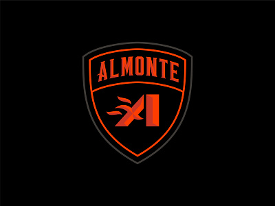
The main mark features an dominant A, but when you look closer, the embers from an inferno can be seen bursting from the left hand side, and the I for Inferno can be seen dividing the A into an AI.
Since they will be a new team, putting a name to the logo for the first few seasons will be important, hence the decision to place the main A mark into a shield that features the town name.
This identity comes with a versatile pair of custom hand-lettered wordmark logos that can be used on both dark and light backgrounds with a simple colour change.
Finally, this package comes with a custom set of jerseys that will be put into use for the 2022-23 season.