Universal Data Visualization | Quick color and font changes


You can use the default color scheme and font or change them to create your own design.
UNIVERSAL DATA VISUALIZATION
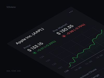
Universal Data Visualization is a high-quality tool for creating charts and infographics in Figma. Easy way to visualize your data in seconds.
ALL IN ONE FILE
- Getting Started (Guide)
- Four pre-made Dashboards
- 80+ pre-made Blocks
- 100+ Components
- Styleguide
- 105 Icons
PRODUCT FEATURES
- Easy drag & drop
- Flexible modification
- Quick color and font changes
CONTACT AND SUPPORT
Feel free to send me your feedback at support@123d.one
I appreciate your comments, likes and shares.