UI design for Online Service Marketplace

Hi all!
Remember, we told you about the activity booking platform for kids we built? Let’s get back to this project once again and talk about its UI design.
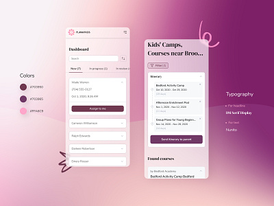
While we were creating online service marketplace PlanMyKids, we wanted to make its design both eye-catching and neat. Designing a platform with kids in mind, we wanted to make it less official and the least formal. This approach is reflected in full in the website’s graphic design, including images choice and colors palette.
Our next task was to pick the colors that go well together. As you can see, we selected purple and pink as the main colors. These two are associated with creativity, don’t they? So we thought it was a great idea to use this combo for an online marketplace for kids. Such a combination also lends a touch of elegance to the entire website design.
To add some playfulness, we added small elements to the web pages that remind children’ drawings. What else? We used two types of fonts: Serif was used for headlines and Sans Serif - for the longer copy to increase readability. Finally, we achieved the general web design clarity with the help of whitespace and typography.
Don't forget to visit Codica’s website for more case studies.
We create user-friendly and fast-loading online marketplaces. Contact us to discuss your idea and get a free quote.