Motley Fool premium dashboard

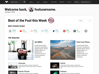


These shots were developed as an exercise to capture the vision of the stakeholders and broaden the thinking of what The Motley Fool would become in a future state when the content and IP scatted across 40 different subscription services would be coalesced down into one primary dashboard and set of subsequent pages.
These treatments offer a blueprint for a new direction for The Motley Fool user experience, meeting the user where they are, providing the content more relevant for them at the time of their visit. It also provided an evolution of the primary UI to integrate updated concepts for company logos, stock packs and laying out an article collection.