Keynote App Icon • Redesign

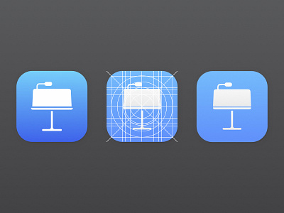
I've always felt that Apple failed to follow their own Design Do's and Dont's consistently. In my time examining all of Apple's app icon design and doing the same for many third party apps I was especially bothered by how close Keynote was to having a "solid" icon design. Here's what I did to fix what I feel were it's shortcomings.
- More subtle/less eye straining color and gradient.
- Slightly simplified glyph.
- Follows "The Grid" more accurately.