Motley Fool Rising Stars

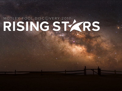
The new product Rising Stars is intended metaphorically to denote growth stocks, but the name provided the opportunity to leverage a more literal depiction. The letter A was replaced with a stylized star icon. The image from Unsplash providing a means to make a pretty unflattering brown hue work as the default color for this product.
I later broke this image into layers of the fence and ground and the sky, and put a a slow vertical animation on the sky layer so the stars would subtly move across the screen, across the sky, while on this page.
This logo and treatment was in use by The Motley Fool from 2017 through 2020.