Monk-ID - Concept 3 🟠

MONK-ID - Logo Concept Part 3.
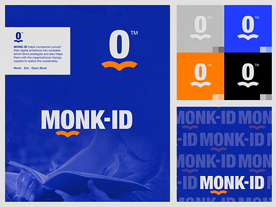
MONK-ID helps companies convert their digital ambitions into workable (short-term) strategies and also helps them with the organizational change needed to realize this sustainably.
While designing this concept, the following concept ‘ingredients’ I kept in mind:
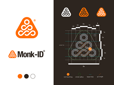
- Leading line / Repeat
- Monk
- Zen / Balanced
- Urban Vibe / Bold letters and strong symbol
The moment I settled for this concept, the visual balance really got to me. Thereby I'd love to share this one with you before presenting it to my client.
Have you ever seen something similar like this before (the monk and shape in overall)? Would love to hear your thoughts and possible points of feedback to further develop this concept to perfection.
Thanks!
Jeroen
___
Want to work with me and create a mark, together?
Feel free to reach out via my E-mail or Dribbble DM: