Dove Logo WIP

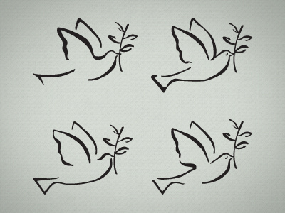
Here are four very similar but different renditions of a logo redesign for a Christian retirement home. The client currently has this same dove shape as their logo. I traced it, giving it the variation in line weight, for a more modern look. Client has yet to see it, any thoughts and feedback?