Daily UI 005 - App Icon

Challenge 005: Design an app icon. What best represents the brand or product? Or is it incredibly unique? Does it look great at a distance and does it stand out when put on your home screen alongside other apps?
I wasn't quite sure what to make of this challenge initially. As an aspiring UX Designer, I believed that I would be working with UI designers and/or graphic designers for a project like this.
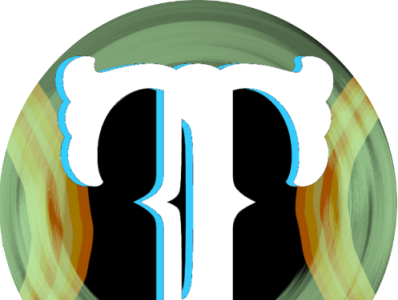
I thought of a modern news app; specifically news articles. News outlets tend to lean towards a more traditional look to them, thus having fonts such as Engravers Old English BT font used in both the Washington Post's and the New York Times's logos. To make the T stand out more, I gave it a light blue shadow and a black background.
The circles of the icon also help make the app feel more like a button that should be pushed; an app that should be opened rather than another static image the user places on their home screen. Users typically look at middle of an image first then shift their eyes to where the image to lead them. In this case, the T will naturally lead the user along the shape of the letter: either downward toward the bottom of the icon, or out and to the sides of it. Immediately after this, their eyes will meet the edges of the circles, leading them back towards other parts of the T, then back out to the circle.
To summarize, using a T and circles creates a cyclical image, making the app feel more enticing to open.
I chose to use orange and green so they could contrast nicely with each other and with the rest of the pieces to help emphasize each and every aspect of the icon. I chose to make the circles light and faded so they wouldn't overpower the T in the center.
I created this image using a series of drawing apps on the Google Play Store, then cleaning it up on the PC drawing program: paint.net