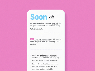
Personal portfolio, soon. -ish.
Quite a long time since I posted any work, anywhere. After reading “Art & Fear” by David Bayles I decided it's time. No more fear. Can't wait to show you folks what I've been doing and hopefully take you on a visual journey with me from now on.
I'd really appreciate it if you went to check out my coming soon page on https://mateitudor.com → any feedback is most welcomed 🖤
There's also a newsletter signup, if you want to (very seldomly) receive goodies, design + code stuff, but also thoughts on how we can be better, more ethical, more intersectional as people fortunate enough to do what we do everyday as a job.
Hope you like this quick, completely hand-coded thing as much as I do. A few nerdy behind-the-scenes details:
● The colors were chosen to represent the trans community of which I am a part of, being nonbinary;
● The heading typeface is called “New Frank”, by Miles Newlyn: https://fonts.adobe.com/fonts/frank-new;
● The “-ish” font is called “Park Lane”, by Alan Meeks: https://fonts.adobe.com/fonts/park-lane
● And finally, the body copy typeface is just a system monospaced font, because it's cute.

