WIP Typography Improvements

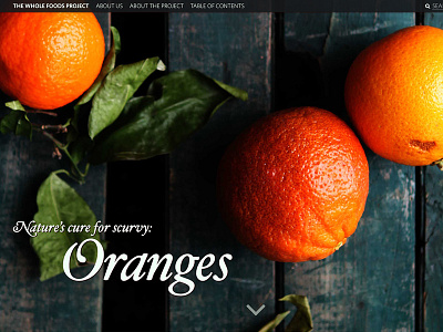
Opted for Hoefler Text Italic Swash and a slight opacity drop, plus dropped the blurred background bar. Makes the design a little less heavy, I think.
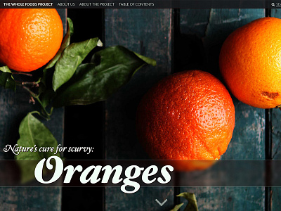
Opted for Hoefler Text Italic Swash and a slight opacity drop, plus dropped the blurred background bar. Makes the design a little less heavy, I think.