Saien — Clothing Brand Logo Design

============
Logo Concept
============
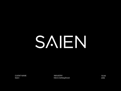
1. All caps is to make the logotype bold and authoritative.
2. Square and pointy edges are used to give it a masculine feel.
3. The letters are tightly but elegantly spaced-out to show the quick turnaround time that Saien provides with a professional output.
4. The crossbar of “A” is removed to show that Saien does custom-fit tailoring.
====================
Background Information
====================
Saien provides men's custom-fit eastern wear tailoring.
The main task was to neutralize the ethnic feel attached to the word "Saien" with a modern/western touch.
Therefore, the client did not want us to use any symbol or color that has an ethnic resemblance.
The main target audience is affluent men between the ages of 28 and 60.