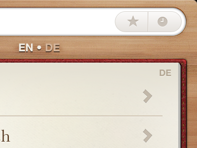
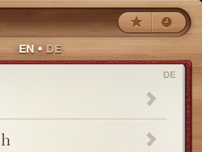
Wood


Critique encouraged, as is telling me which you prefer. :D
This is the wood version, consistent with the previous iterations.
But I've also done a white version and plan to mirror any changes to both versions.
I tried changing the layout quite a bit today, for example:
• having the language indicator right at the bottom — this was nice in theory but has practical implications: when the keyboard is brought up, the language is hidden, making it not immediately obvious which language the user is searching in.
• having the language indicator right at the top, with the search bar moved closer to the book — this looked strange, but also weakens the metaphorical connection between the book and the indicator.
The button in the search field is a single button (as in Articles.app) which will bring up the bookmarks (star) and history (clock) view.
Most of the work now is just pixel-by-pixel stuff, tweaking the tiniest details, which is tiring but rewarding work. Then I want to do some more work on the positioning, sizing and formatting of the content of the pages, after which this concept should be largely complete. :)
Finally will be the app's icon, which will be interesting — another first for me.
Also I just realised the language indicator isn't showing the correct language. Ignore that. :x