EthosCE Medical Education - Mobile


😎Hey guys!
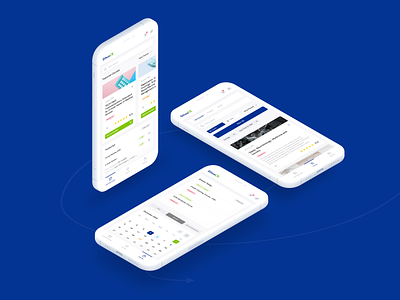
Today we want to share more information about this case. Let us focus on how we reformed the flow on each step of the experience, starting from finding and buying a course and to passing final tests.
🥇First Flow
When we started looking for ways to rework the flow, first of all, we tackled issues connected to passing tests. Our goal was to help users focus on their main activity in this section and make it as easy and pleasant as possible. Primarily, we got rid of ALL of the timers and unnecessary elements that could have distracted the user from the test.
🥈Second Flow
Then our magical transformation process got to the main page of the course itself. The goal here was to make it visually understandable and informative, helping the user to find any information needed after they bought the course.
🥉Third Flow
When designing the course purchase process, we decided to stick to standard patterns so that users will have no trouble with linking their bank cards. This allows one-click purchases in future, shortens the buying pattern and improves conversion.
---
💌 We are glow Agency
We help companies design efficient digital products. We also design web & mobile apps from sketch to launch, improving them over time. Our mission is to bring our clients’ products to a whole new level by solving real problems and reaching business goals.
Check Full project at glow.team
Follow us below:
Clutch / Facebook / Instagram / Behance / Medium / LinkedIn
More screens are coming soon.
But for now share some love with Glow, press ‘L’ ❤️