Boerman Metselwerken

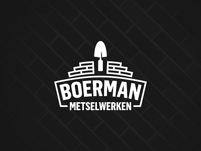
Logo for a friend who started out for himself. Wanted to keep it simple, strong and straightforward.
To keep with this briefing i researched ways of stacking bricks (there's quite a craft to it, i found out) and explored the ways of corbelling (making arches with bricks) when it was too hard and too abstract to work out an arched layer of bricks, i figured i'd just make the font of company name arched, as a subtle reference.
Hope you like it!
BTW: Font is Flama Condensed, and it's awesome!