Refreshed Team Report


At work, understanding how your team is doing is complicated. It involves so many factors and dimensions. The same holds true when you collect data about your team. There's a lot to unpack and it can be tough to get clear focus on the most important things.
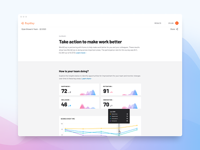
Working with our team of (amazing) scientists, we refreshed this report page to be simpler and easier to understand — while still delivering powerful insights. One of my favorite elements is the custom multi-layer density plot (a.k.a. histogram, depending on your dataviz preferences) with gradient shading to make it clear at a glance how your team is doing on different dimensions. Of course, you can dig deeper from there with advanced views, but a clear summary is powerful.