Renno Branding

I did a very light refresh on the Renno brand before launch. There were two primary changes I focused on:
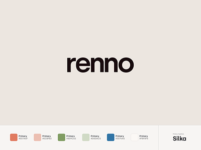
Updating the logo. I made some slight adjustments to the Renno wordmark and rounded it a bit so that it felt more friendly and approachable.
Brightening the colors. With most brands I work with, I find that their colors work in digital, but are usually a bit dull. I enjoy Renno’s warm and friendly color scheme and I pumped up the brightness a little bit on all of these colors so they stand out more on the website.