Business Cards Design

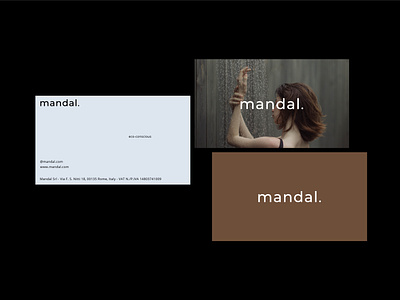
We had a mindful approach towards creating a brand identity for a skincare brand Mandal that is targeted to the people at their 20s.
In order to address Mandal to that specific target group, we’ve particularly payed attention to:
- Color Palette
We’ve made up a corporate color palette from muted and pale shades, avoiding vivid contrasts, what helps add more modernity, exclusivity, and unconventionality to the brand perception by the target group.
- Text Layout
The innovativeness of the project got supported by the unique text layouts focused on keeping measured spaces between the text blocks that enables to maintain the typography readable and avoid the composition to be overwhelmed.
- Minimalism
The less is more, and so, by avoiding complex design elements, we’ve kept the design minimalistic what communicates relax, naturalness, and informality that are highly valued by the younger part of Millenials and the oldest part of Generation Z.
Tell us about your challenge and we’ll find a mindful solution:
contact@katezest.com