iOS clock icon

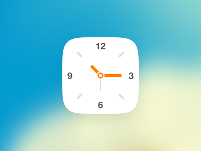
I am personally not fond of the current iOS7 clock icon. I think the circular shape inside of the icon clashes aesthetically.
I've tried simplifying it by:
- a light icon background, putting focus on the clock elements. This matches the calendar design from iOS as well
- Less focus on the second-hand, and hopefully making reading time more relaxing. I always feel rushed by looking at the seconds going by, or is that just me?! ;-)
- Larger, bolder numbers for the hours, since the current ones are fairly small.
I now realize the state of the clock is actually unrealistic. The small hand shows it's about 10:30, while the larger one it's around 10:15. Anyway, it's only for visual demonstration I guess!