Uber Eats App Redesign


The team is available for new projects! Drop us a line: hello@purrweb.com | WhatsApp | Website
Hey-hey, dribbblers! Do you guys often order food from Uber Eats? We thought, what if the app looked a little different and made this redesign! 🍕
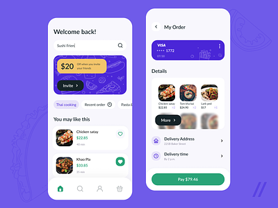
🌮 The first screen is the main screen, here users can search for dishes and repeat the last order. There’s also a banner with an offer from Uber.
💰 On the second screen you can see order information: payment method, list of chosen dishes, address, delivery time and the final price.
☂️ When choosing the color scheme, we decided to keep the Uber’s brand colors: black, green and mustard yellow. To freshen the design, we added a new color — bright purple. It perfectly combines with the other colors.
👍 The interface now looks more modern and pretty. We got rid of extra elements that used to clutter the screens — now the app is much more usable.
Press L if you like our design and share feedback!
We are already experienced in app development for the foodtech industry, check out our case!
Created by Valeria Sablina
PS We know to utilize UI/UX design to make users fall in love with a product. Check out how we used our skills to:
- raise $400k as capital for startup
- streamline cryptocurrency e-wallet
- reboot a Real Estate startup
- help newbies jump into investing
- conquer the chef freelance market
- simplify the life of event organizers
And that's not all — you can find more case studies in our Blog! 💜