Soldiers Connect - UI (1/2) (2017)

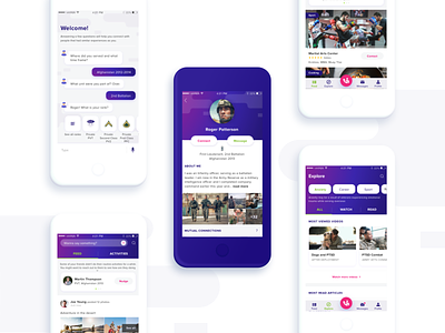
A while ago I had the great chance to work on a wonderful project that helps veterans integrate back into society by being part of a community, get PTSD support, create daily routines, stay active and watch over each other. Although this app is dedicated to soldiers, I didn’t want the colour palette to be related to the army camouflage, as I wanted to help users get out a bit from the army patterns and slowly start fresh. I wanted the colours to express trust, order, loyalty, peace, control, calm using the color blue; love, care, possibilities, respect with pink; power, ambition, independence with purple and equilibrium, positivity, clarity, safety using green.