Logo design for Rock Alliance

Final logotype for Rock Alliance. The company sells ballast (stone and gravel). Typical customers are local construction companies, nationwide construction corporations, cement- and asphalt mills. The customers care about getting delivery on time, with the right quality. Secondly also price. Customers are mainly reached through contacts. Most people who work within this industry are men, and the ones that RA meet are in the age from 50 to 70. There are different competitors – a few larger companies that have branches that deals with ballast: Swerock, Svevia, NCC Industry and Skanska Industrial Solutions. And, there are also a few smaller competitors, like for example Ledins grus and Råsjö kross. RA stands for: Passion, Trustworthiness, Sportiness and Professionalism.
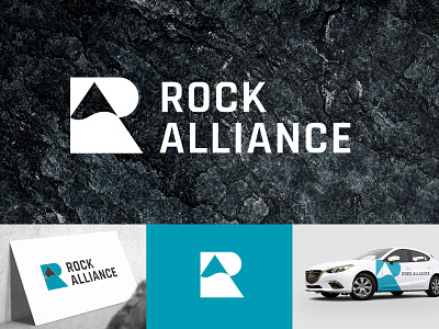
After trying out different solutions we landed in a minimal monogram symbol that combines R + A + rock. The chosen letter style for the company name is robust with sharp edges – this suits the target group and gives great visual contrast to the monogram symbol.