


AmpleNuSoft - A display type family

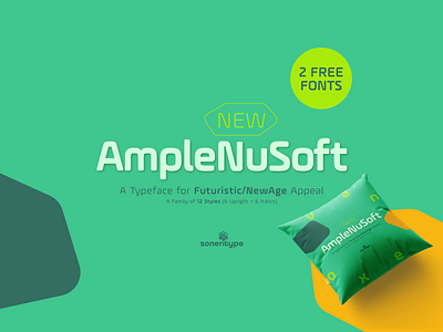
AmpleNuSoft - A display type family for Futuristic and New Age Appeal
AmpleNuSoft is a display type family derived from the AmpleNu typeface by softening the edges.
It has optical mono-linear stroke and a bit squarish form in nature. It has a seamless stroke movement instead of sharp angles formed by the junction of two strokes, which is a prominent feature of its design.
It is designed to be a little eye-catching yet legible. It has clear and distinguishable letterforms, which helps to elaborate and emphasise the message. It is graphically strong and commands the viewer's attention. The overall appearance of type is suitable for setting and using it as heading, title, headline, logotype, etc.
The type family consists of twelve styles which include six upright weights and their italics.
AmpleNuSoft has a bit more squarish counters and angles than Ample typeface, it even has straight terminals while Ample has a slight curve. In addition to this, few characters have some major or minor changes and the letter ‘g’ plus ‘y’ and their respective diacritics have alternate style variations.
AmpleNuSoft is designed by Aakash Soneri during the period between 2020-2021.
Available at:
Fontspring.com
Myfonts.com