


boo.ua — Product Exploration Flow


Building the Shortest Path to the Product
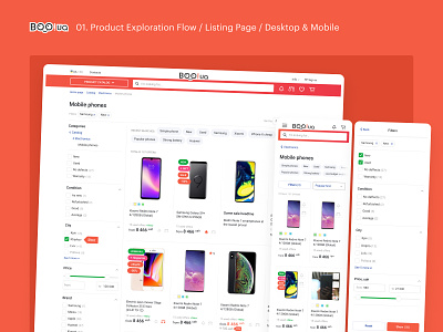
The structure of a website catalog is subject to many factors — SEO, merchandise experts, integration with external systems, suppliers, etc. Catalog required optimization based on a seemingly obvious principle — the shorter the path to the product, the better. We’ve reduced the complex and heterogeneous catalog to only two templates: a category listing page and a product listing page.
When the problems with unnecessary generalizations and artificiality in the structure were solved, we focused on the product category pages, and set the following goals:
✓ to execute thoughtful and user-friendly design for desktop and mobile;
✓ to come up with new filter groups based on users expectations;
✓ to supplement each filter with a counter of the quantity of the offers;
✓ to introduce users with a way to for new arrivals within a filtered catalog listing;
✓ to add marketing and helpful suggestions sections into the product listing.
The anatomy and structure of the product card have also been optimized: we’ve increased a photo size, added a visible set of key characteristics, and a counter of the quantity of the offers and their condition.
One of the big goals was also to remove visual rubbish from the header, thus highlighting the most important navigation elements – menus, search, links to info pages, login buttons, and shopping cart.
On mobile, it was important to offer the user an obvious search option, as well as reduce the number of menus to one (yes, there were several).
We paid special attention to search and menus on desktop and mobile: we set ourselves the goal to create an end-to-end, easily accessible, and universal navigation that can withstand the broadest structure with a tendency to an increase in the number of product categories.
Special kudos to Vladyslav Dobryda who did great on the UI side of this project.