


Surf Søstre

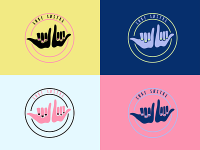
Surf Søstre is a surf and water sports community for women in the Nordic regions. We worked with Surf Søstre on their logo and visual identity. We wanted the logo to be a symbol of female solidarity, an open-armed welcome to all women. It is fun, playful, unintimidating and friendly - and it feels like the surf’s up. While refraining from being too ‘feminine’, the nail varnish gives a wink to all the ladies out there. It also includes a mantra, ‘for sisters who are stoked about the sea’, which encapsulates a love of water-sports as well as ocean preservation. The visual identity should feel visceral, playful, exciting and adventurous, with primary colours inspired by nature.
Surf Søstre is a warrior cry to the fearless women. The girls who can and the girls who can’t, but want to anyway. Embracing the grazes and bruises, the curves and the messy hair. Imperfectly beautiful. Raw and real. Surf Søstre’s exists to inspire the women who are inspired by nature. It's the movement that gets you moving, for the outsiders who want to get outside more and for nature lovers who love feeling like natural women 🌊🤟