Photo of Stationery | Sangat | Wellness Centre and Spa

The Sanskrit term “Sangat” indicates the people, the disciplines and the cultures who share the same noble ideals: freedom to be and express themselves, unconditional love for themselves and the world.
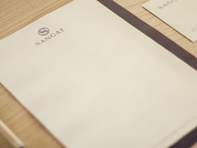
The symbol we projected for the Wellness Centre Sangat is the initial letter of the name, composed of two shapes which blend together into a circle, metaphor of balance between body and mind, which is the means and the purpose at the same time to reach the Sangat, i.e. the universal harmony and balance with the whole.
We designed an uppercase typeface, light and with minimal contrasts, whose linearity is interrupted by the enlargment of some stems' terminals in order to express concepts like harmony, synergy, nature, but also elegance, excellence and quality.
These concepts have been reinforced by choosing a warm colour, a very natural-looking paper and a special finishing of the print.
Complete project on Behance: http://bit.ly/1hECeon