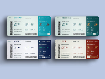
Airplane Ticket Redesign
We noticed there are many poorly designed physical tickets out there. And we thought why wouldn't we redesign them and make them easier to read and understand. Without losing too much time on finding your gate, seat, ticket number, or even time and date.
We took Cathay Pacific company, did a logo redesign concept, and redesigned their physical flight tickets as well, for 4 different flight categories where each category represents a different color.
Let us know what do you think in the comments and is this something that is more intuitive for you?
branding
design
flight booking
flights
flight ticket
graphic design
illustration
minimalistic
physical ticket
product
rebranding
ticket design
typography
vector
View all tags
Posted on
Feb 16, 2021
More by Broworks View profile
Like


