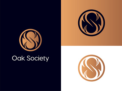
Oak Society - Logo Design
To incorporate elements of nature, the logo mark is encompassed of the letters "O" and "S" with the illusion of an embossed effect. Considering that "society" is the aim of this organization, the letters are made to look they are also intertwined to imply connectivity.
View all tags
Posted on
Feb 15, 2021
More by Waffleson View profile
Like

