Letterman's Branding

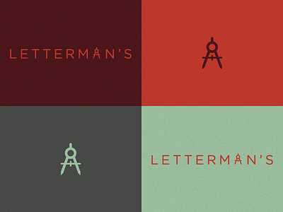
Started working on the rebrand of a local print shop that's been around for over 65 years! Trying to keep the look classic yet modern. What do you think about the color palette? Is the compass incorporated into the type too expected???