


1st Logo Design Concept - Kurimu Pafu

First logo that I've ever made for fake Japanese bakery business scenario "Kurimu Pafu" that sells choux pastry (cream puff).
------------------------------------------------------------------
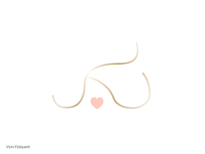
- Idea
How to represent the cave-like-silhouette from the mascot, create a luxury-bakery vibe like, and represent the “K” letter from the brand name, “Kurimu Pafu” altogether. The heart shape in the middle represents how lovely the bakery is in terms of the texture of the choux pastries that they made. It represents the warm, cuddly, and lovely taste of the cream puff (choux pastry).
- Execution
Make the “K” silhouette-cream puff like shape, add the heart shape underneath it.
- Colour
Gold colour to add the luxury aesthetic vibe and pink colour to add the sweet, cute, lovely vibe.
------------------------------------------------------------------
Please feel free to give feedbacks about the design, colour, and the concept, thank you! ❤️