卓越聚变 ZYGroup Ceremony

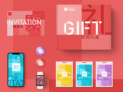
The main vision starts from the rigorous tonality of the brand, placing the logo in the center of the Key visual, extracting the visual gene of the brand's "square", and splicing it by the art of dividing the surrounding blocks.
The picture gathers from the periphery to the center, expressing the concept of "gathering", the transformation of the shades of scattered color blocks, and the integration of changing elements such as broken lines and diagonal lines, reflecting the connotation of "change";
The text slogan chooses simple boldface, and breaks out some of the strokes, which means "breakthrough" oneself. The layout is flexible and changeable around the color block space. The color is selected from the festive red of the Chinese, and the auxiliary colors are yellow, blue and purple.