To Icon


To [icon] spearheaded by
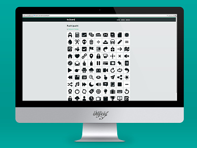
The Artificial started because icons deserve our time. Just like letterforms, icon-forms should be carefully plotted with specific weights and styles; like letters, they should work together to communicate words and sentences and stories; and like a well-formed typeface, they should be legible even at the smallest sizes. Check it out