


Personal Logo Mark - K

Continue to explore k logo mark for my personal logo. I try to go for K instead of KL or kailoon this time.
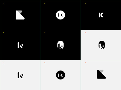
1 & 9 — basic shape that reflect my approach of design.
2 & 8 — using code to show the services I am providing: design + code.
3 — combinations of half circle and a vertical rectangle to form the k.
4 & 7 — showcase that tailored made and perfection in my design work with this custom drawn k letter.
5 & 6 — combine the letter with an unusual shape used in logo mark. I kinda like it.
What do you think? Which one is your favourite?
Press L if you like it and feedback is welcome. Follow me so you can get updated and we can talk about design or, become friends :)