Typography Illustration

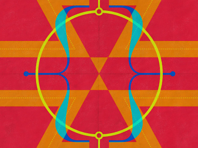


While looking at Typefaces for 2021, I came upon Azo on Adobe Fonts. The Z in particular spoke to me. It was that Zed I had always searched for; both classic and modern, with just the right proportions. Somehow, my eye caught a form that happens when the z is mirrored, resulting in a distinct arrow shape. I outlined the Z’s in Adobe Illustrator and used pathfinder to make all four Z’s one single shape so I could change colors easily. To create some contrast with the hard lines of my geometric layout, I had my eye on the uniquely sublime brackets that come with the AWConqueror Std Didot Light typeface. To get the old paper and printer’s halftone effect, I ran my pngs through the powerful PosterPress generator by Ian Barnard. Which one would you pin up in your studio? Follow me on Instagram @yasgraphical.