UseMusic Navigation

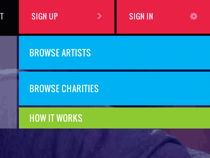
This website experience did not require traditional navigation, so the masthead was designed to really drive home the colorful brand created for the organization. To help foster the grid and keep space compact, I explored alternatives for hover menus. I thought splitting the parent button into two child buttons on mouseover worked great to meet these objectives.