Procreate app icon redesign


Helloooo once again:)
One of my dearest friends told me about this competition of Savage Interactive to redesign Procreate app icon.
I do use Procreate a lot for sketching, illustrating (which I don't do very well) and mostly typography. Practically it has become one of my favourite applications to dive in for hours.
I don't really think there's something wrong with the current icon, its sharp, its vibrant, its eye catching and does it's job perfectly. Most interesting part of this "experiment" was to see how my mind, eye and hand feels it and create something of my own. I do like it, but how I would like it more ?
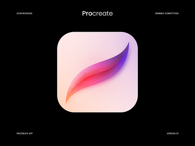
So I started to redraw this tiny, but not too easy shape for couple of times, tried applying some of my favourite grids and finally came to this cutie (at least for me).
The icon is built on a rectangle grid, overall shape is bolder than the original, current one is slim and too sharp for my eye. I decided that the sharp corners of are one of the main game changers in the original icon, so I made them a tiiiiiiny bit wider.
The colour choice for my icon is way too far from the original, I do like their vibrant and eyecatching colours and I do also like my colours, which feels like the colours shape-shift a bit smoothly. I absolutely love how well the colours of original icon work with each other, but I had to change something to participate, right? :)
I tried to approach it artistically too, so there is a version of noisy illustrative icon on the first shot, which I liked instantly and decided that it deserves a tiny space on dribbble:)
Thank you!
Let me know what you think!
#GetCreativeWithProcreate