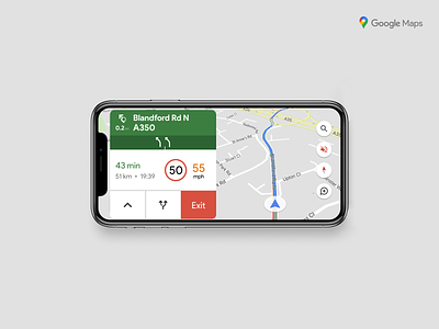
Google Maps redesign
A few days ago, during a long drive, I realized how poorly accessible is the Google Maps interface. Moreover, if you drive against the light and wearing sunglasses, the tiny information is almost completely invisible. Finally, the presence of the route on the right side of the screen would allow us to make better use of the free space on the left.
So I tried to redesign the interface to make it more accessible, increasing the readability of texts and the clickability of graphic elements.
Drivers, what do you think?
Posted on
Dec 4, 2020
More by Luca Toscano View profile
Like


