


redesigning search #3

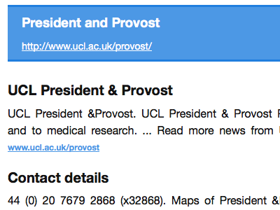
On some search results the site visitor will get a 'this is probably what you want' link or a 'best bit' (It can also take a description in the result too). This is taking the blue that's being used on the search button on the page to make a nice highlight. I've tried a yellow that's in the palette available but it seemed too 'in your face'.
Note the search results have gained some more spacing and also the dividing rule has gone.