Invisible Cities Book Cover


As a side project I created a book for Italo Calvino's novel, Invisible Cities.
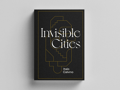
For the primary typeface I wanted something intricate and ornate. 'Voyage' from VJ-Type fit the aesthetic I was looking for perfectly, with a huge number of stylistic ligatures available to make the title feel specifically crafted. Much of the stories in the book are about the complex interwoven lives and crossing paths of each city's inhabitants, to reflect this I created a geometric, vaguely-architectural illustration that would weave in and out of the title and provide a motif to use throughout the book design.
As a secondary typeface I wanted something reserved and neutral so as not to clash with the intricacy of Voyage, but still with some warmth and personality, I found this in Linear Sans which is used for supporting text such as the author name on the cover.