Immo Capital - Branding


Hi folks!
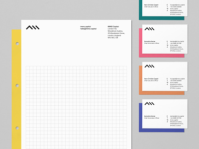
Showing here some of the brand refresh we did for IMMO.
For this project, we stripped down IMMO’s visual identity to its core elements –the colour yellow and the roof icon. Putting these two elements central and front, we built an identity around them with a new wordmark, colour palette, typeface and logo system that could extend to its different sub-brands.
Immo Capital is a next-generation asset manager & operating partner to institutional real estate investors. Immo Capital uses AI to source & underwrite single unit/family homes into large portfolios of stabilised rental income with capital appreciation and active management.
The company is based out of London but operates both in Hamburg and Delhi. Immo Capital has raised €72 million so far, to expand the company’s residential platform and general growth.
Thanks to the great team at IMMO for their help on the project, as well as BB’s fine talent including Wes for web design, Marino for frontend development, and CMS integration, Filip for the creative direction and myself for the visual identity.
Check out the LIVE SITE
All the best,
Vicente