Dubrovnik ...

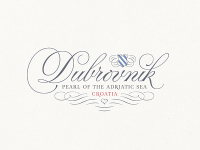

… pearl of the Adriatic Sea! I made this »lettering« (it’s not hand lettered) for a small Croatian startup company (maybe you remember the »Domano« logo from last year) producing and distributing souvenirs and gift items. The »lettering« – if accepted – will be printed on some of those items.
The task was to create a classic »Dubrovnik Typo« that attracts, expressing love for the town, its history and the sea. I combined those »key elements« adding wavy ornaments (sea) beneath the lettering (city) and placing the Coat of Arms of Dubrovnik in the Austrian Empire (History) between the »b« and the »k« (I added some ornaments on its left an right side because of the overall balance). – I don’t know if the choice of this Coat of Arms from a historical point of view is OK. I have chosen it, because it looks stylish and simple, in addition it fits to the color scheme. Finally, to express love for all the »key elements«, I placed a little calligraphic heart inside the wavy ornament beneath the »lettering«.