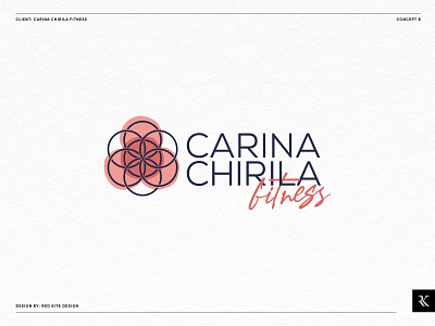
Carina Chirila Fitness: Logo Design Concept B
Carina Chirila Fitness is an elite personal training service offering both one-to-one coaching and semi-private group sessions, with support beyond the gym, including lifestyle and dietary advice. Coaching is available to everyone, however a core target market is busyprofessionals in their mid 30s to early 40s.
Our goal was to create a brand identity that is clean, modern and minimal, appealing to a wide demographic, with the versatility to be applied to apparel and other marketing material in the future.
Carina’s approach is based around balancing three key pillars; performance, aesthetics and lifestyle. This concept uses intersecting circles to form a symbol of this philosophy. The circles also creates a simple mandala shape, which in various spiritual traditions is used for focus, guidance and harmony.
Another clean, modern sans serif font is used to highlight Carina’s name as the key focal point of the logo, and a more playful secondary font for ‘fitness’. Pink tones are used in this concept, associated with nurturing, compassion and empathy.


