Ceale Cosmetics packaging design

Hi guys!
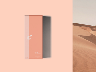
This is a packaging design I made as a part of Ceale brand identity. It uses a minimal version of Ceale logo and brand color palette.
The two-tone packaging is designed to look minimal while containing all the needed information in the bottom half. The text has low enough contrast to look somewhat "stealthy", but high enough to stay readable.
The full case study can be found here: https://www.behance.net/gallery/103119879/Ceale-Cosmetics-brand-identity
Drop your thoughts in the comments!