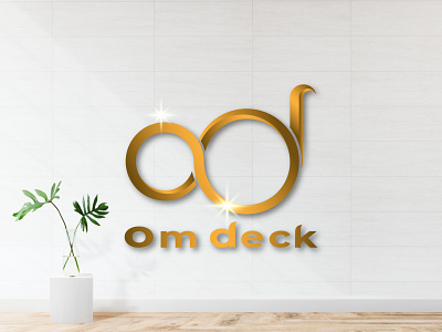
om deck
Hello guys,
This logo is a work that I did according to an order from a client for his company.
This logic takes the prefix of the letters o (om) and d (deck) as the main characteristics of the logo, while for color, gold is used because it means achievement, luxury, victory, and also prosperity.
Thank You :)
abstract
background
business
design
elegant
element
gold
golden
graphic
icon
illustration
logo
logo new
luxury
modern
om deck
sign
symbol
template
vector
View all tags
Posted on
Oct 2, 2020
More by Work 19 Studio View profile
Like

