


ACE Branding


BRIEF
👇
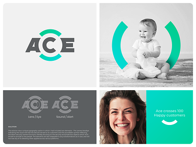
ACE, which is the abbreviation of Alarm CCTV Edge, is a Company offering the latest in security and protection technologies such as alarm security cameras, smart security applications for mobile phones and likewise. The client approached me for their Branding and their requirement was a logotype; a typography-based logo for the 3 letter name' "ACE".
CHALLENGES
👇
Though the name of the Company was a short one, the fact itself was the main challenge while designing their logo. Because the short name required a typography-based logo which means literally no icons and at the same time, the typography required to contain in itself elements that would reflect the business.
Also, the elements being included if at all should have been such that it is usable in its other associated Brand applications.
SOLUTION
👇
The solution was a unique typography option in which I had included two elements - The camera lens/eye indicating the visual role that the devices served to its customers and the sound/alert symbol reflecting the alarm security camera functions, thereby focusing on the security and protection aspects which 'ACE' strived to provide to the people. The elements are also adaptable to any transformations as in size, and will not lose any of its detailing when applied across various platforms.
For Branding/Logo Design?
📧 Contact: spgmarks@gmail.com or DM